Darren Tonn is Incite’s Creative Director and a Partner with over two decades of design experience. In this article he takes time to reflect on key learnings from decades of designing visual brands for our clients:
Wow, it’s quite the task to reflect back on over 20 years of logos (or what you might hear us refer to as the visual identity system). I love the challenge of coming up with an appropriate look and feel that represents both how a company is positioned in the market and where it wants to head in the future. I strive to develop logos that have a clear purpose, hold meaning, and help build a narrative that represents the identity of a company it belongs to.
I would estimate that I’ve developed over 200 logos, so you’d think I’ve learned a thing or two. I sure have! And I am still learning every day. Here are a few of my main takeaways over the years:

1. The visual brand must be aligned with the verbal brand.
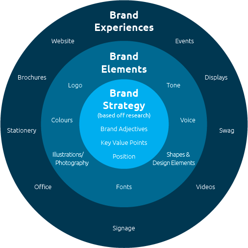
A strength of Incite’s is clarifying organizational positioning for our clients so they can compete and grow, and articulating how to communicate that value verbally. This is what I mean when I say “verbal brand”. My role is to make sure the visual matches the verbal. This is extremely important.
You must understand your organization’s market position before trying to communicate your value externally, otherwise, what meaning are you truly trying to convey through the visual brand?
If you build a strategy with clarified positioning but don’t reflect that through your visual assets then your tools will not be compelling or consistent, and if you try to build a logo without knowing what value it needs to represent and what the organizational direction needs to be, then you have a pretty picture rather than a true identity.
2. Present the solution not options.
Over the years, we have sometimes been asked to show three to five logo options. In my experience, this rarely benefits the client. It tends to open the door for idea generation during the presentation phase and often removes the strategic lens from the logo development process because it becomes a subjective feedback session based on personal likes and dislikes. We then end up with a ‘franken-designed’ end-product.
When we present one logo it does not mean that we only created one logo. For every logo we present, I have probably developed about 20-30 other completely different options and many other slight variations to each of those (adjusting the scale, changing the angles, changing the thickness of lines, fonts, colours, etc.).
Then we always go through a review process with a principal and associate to ensure alignment with strategy and receive their feedback based on market research findings and client needs.It is important that the final logo is a solution that matches the strategies laid out, the organizational positioning, and is something that the client can get excited about.
3. Stay humble, kind, and listen.
This point is important because I don’t want the previous point to come across as arrogant or closed-minded. While the process benefits from presenting one solution, I’ve also learned it is important to listen to the client’s feedback and be humble in a way that shows respect and understanding. After all, this visual brand belongs to the client, and not to me personally. If done right, and we find the balance between collaboration with the client, strategic alignment, and my experience, we should get to a place where the client feels valued and heard but also has full trust in Incite and the creative process.
I have certainly designed some logos where, after obtaining the client’s feedback, I have made changes to the logo creating a result that was better than what I started with, so I know that listening and keeping my ego out of the discussion tends to build a better-finished product.
In Conclusion
The takeaways above should help you understand that a logo is much more than just a symbol of your brand and the process is not always as straightforward as we would like it to be.
Here is a quote from Milton Glaser, an American graphic designer who produced the I Love New York logo and many other iconic designs in New York. This sentiment is always a good reminder for those in the process of designing a visual identity:
”“There are three responses to a piece of design – yes, no, and WOW! Wow is the one to aim for.”
– Milton Glaser


